

Dropbox Growth Design Systems - 2022
Designing the system behind Dropbox’s growth
From fragmented to fast: I built a design system that hit 90% adoption across Dropbox's web surfaces, reduced page launch time by 220%, and unlocked $650k in GNARR.

The Problem
Dropbox's marketing and growth teams were rebuilding the same components over and over. Every new page launch meant starting from scratch, filled with inconsistent patterns, visual debt, and weeks of design and engineering lift before a single experiment could run.
The system wasn't just slowing teams down. It was making experimentation expensive enough that teams stopped running tests they should have been running.
My Role
I was the founding designer for Dropbox's logged-out design system, the one that powers every marketing and growth surface users see before they sign in. I built it from the ground up: structure, component library, token system, documentation, and the adoption strategy to get 9 cross-functional teams actually using it.
The design systems
Balancing these needs required designing a system that was robust yet adaptable, centralized yet flexible, and empowering teams to ship confidently without reinventing patterns.
The users
The design system served a diverse group of internal users:

needed a consistent, flexible library to move faster and stay on-brand.
Designers

relied on reliable components and documentation to reduce code debt.
Developers

needed scalable templates for rapid experimentation and page launches.
Marketers and Growth PMs
Before building anything, I needed to understand how the system's real users — AEM authors, marketers, and growth PMs — actually worked. Not how we assumed they worked.
I ran Author Ridealongs: shadowing AEM authors as they published content, watching where they got stuck, what they renamed, what they searched for, what they gave up on. No surveys. No interviews. Just observation.
What we found changed the system. Component names that made sense to designers were meaningless to authors. Documentation structured around design logic didn't match how marketers thought about pages. The system we'd planned would have been adopted by designers and ignored by everyone else.
We rebuilt the naming conventions, documentation structure, and authoring patterns around what we observed. That's why 90% adoption wasn't just designers , but the whole team.
Designing for the people who'd actually use it
Our goal was to create a scalable, growth-ready design system that could accelerate experimentation and maintain brand integrity. To achieve this, I partnered closely with engineering, brand, and marketing teams through a three-phase process:
System Architecture & Design
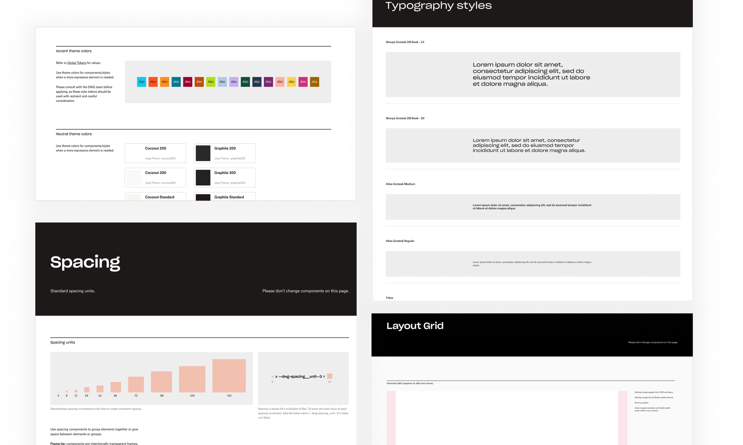
Conducted a comprehensive audit of 200+ web components and marketing patterns, identifying redundancies and performance gaps. Facilitated cross-team workshops to align on design principles and governance.
Audit & Alignment
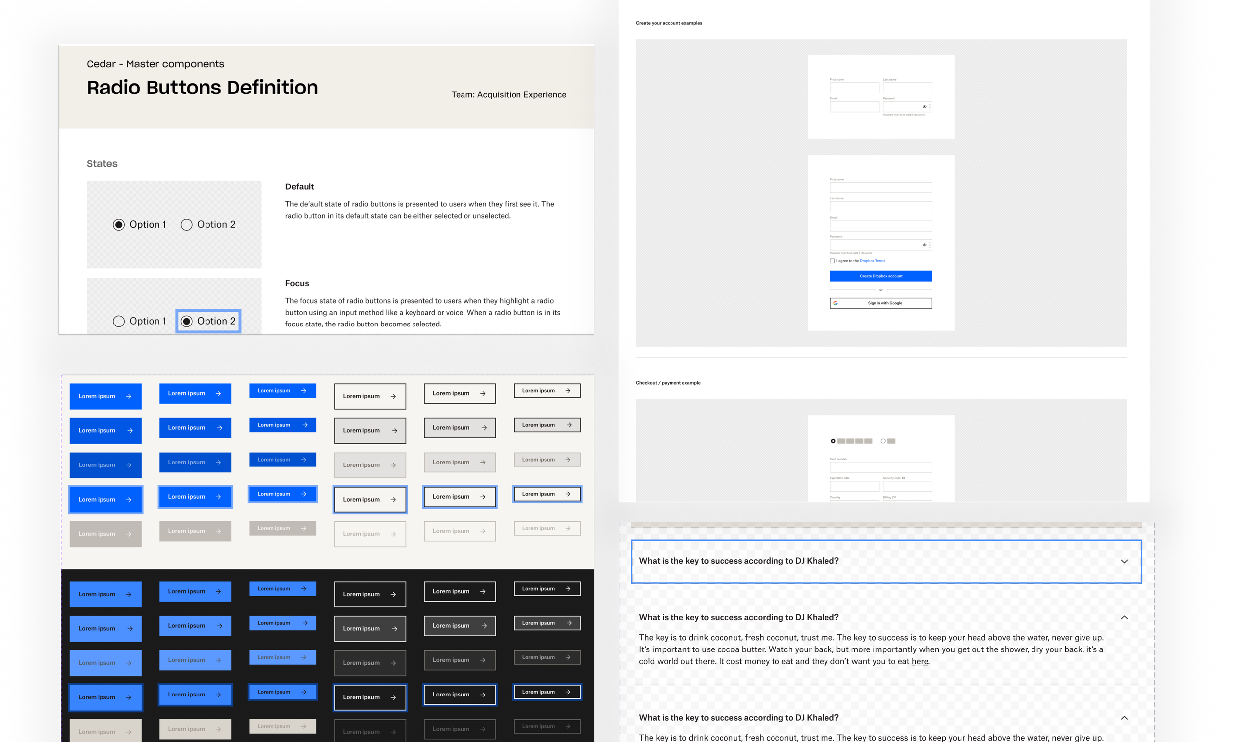
Defined a modular, responsive component library optimized for high-velocity growth experiments. To balance speed with quality, we built preset, opinionated components that guided marketers toward best UX practices, and ensuring consistency and usability across every new page launch.
System Architecture & Design

Impact on the business
What we built
150+
Responsive Components
What it did
9
Cross functional team using the library
1,000+
FIgma insert/week
90%
Adoption across Dropbox web surfaces
220%
Page performance improvement
+650k
Annualized Recurring Revenue