

Stubhub - Mobile 2019
Stubhub Seatmaps: The Rescue Mission
Simplifying a complex ticket-buying experience under tight deadlines

Stubhub’s Challenge
The event page was StubHub’s most visited surface, driving $15M in daily GMS, yet its core seatmap experience was breaking down. Users struggled with an overwhelming, cluttered layout and irrelevant ticket details, leading to a 47% bounce rate and only 2.5% conversion.
Behind the scenes, the design team faced additional friction, such as conflicting stakeholder opinions, an inherited failed framework, and tight deadlines for a high-visibility launch. As one user put it, “The layout is too overwhelming, too many information for me to digest.”
The experience wasn’t just hurting sales, it was eroding trust and usability on StubHub’s most critical revenue surface.
The Opportunity
This challenge presented an opportunity to reimagine the seatmap experience into one that was intuitive, informative, and conversion-focused. By simplifying the layout, prioritizing relevant details, and improving visual clarity, we could reduce friction, restore user confidence, and drive higher engagement and purchase rates.
Beyond fixing usability, this was a chance to align stakeholders around meaningful improvements that helped users find and select the right tickets faster—directly supporting higher conversion and reinforcing StubHub’s credibility in a highly competitive marketplace.
My Approach
As the lead designer, I guided the end-to-end design process, from aligning stakeholders to delivering a cohesive seatmap experience. I facilitated workshops and 1:1 sessions to build a shared vision, and created an actionable research plan that combined data analysis, usability testing, and user interviews to surface key pain points.
To accelerate feedback and decision-making, I developed interactive prototypes that helped teams quickly evaluate design directions. Throughout, I navigated competing opinions and technical constraints, balancing trade-offs while keeping the focus on usability, clarity, and conversion goals. Despite an aggressive timeline, I defined and delivered a clear UX strategy that restored trust and improved the overall event browsing and purchasing experience.
Key Solutions
Simplifying the layout
I simplified the layout to reduce cognitive load and decluttered the interface to surface only the most relevant details—seat location, total price, and key value indicators. By restructuring the hierarchy, users could more easily compare options and understand trade-offs without digging through unnecessary data.
The redesign focused on making the seatmap clearer, faster, and more trustworthy, helping users understand value at a glance and make confident purchase decisions.

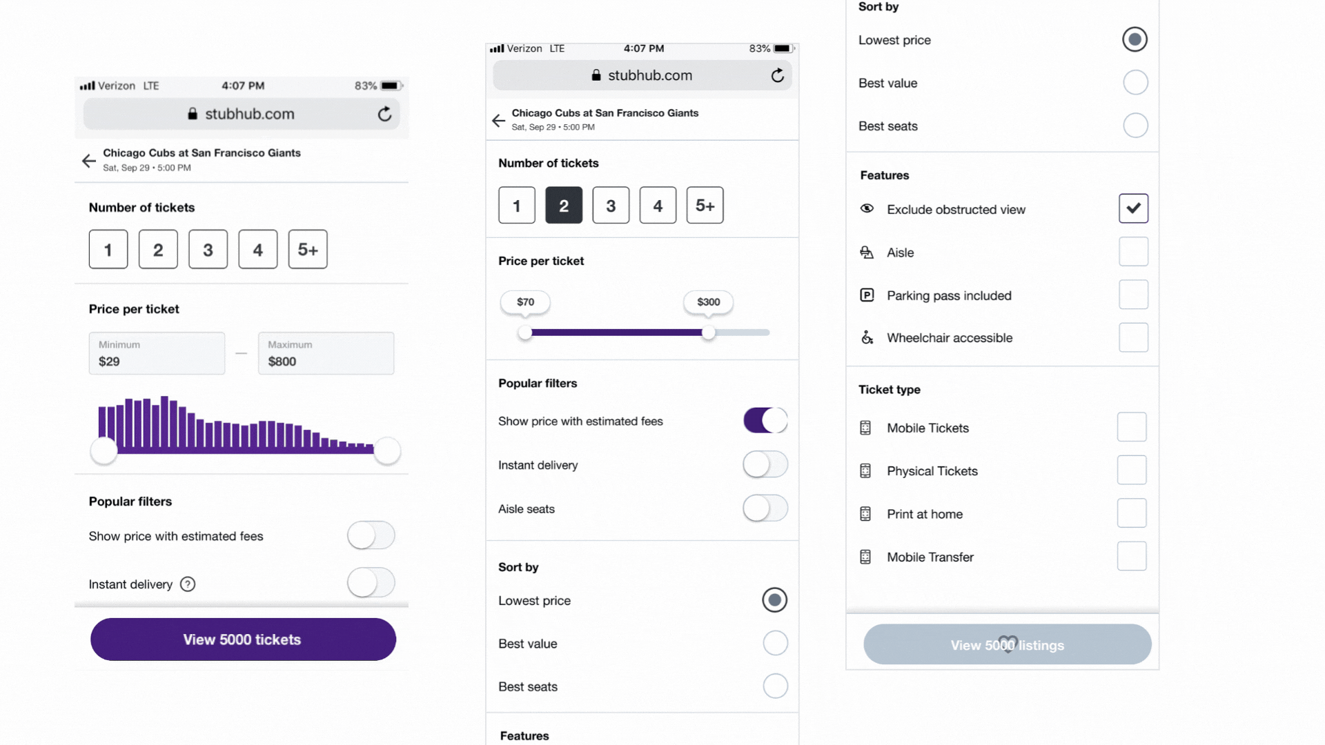
Reducing Overload by Filtering Before the Seatmap
We introduced a full-screen filtering step that helped users quickly narrow down to relevant tickets before entering the seatmap. This reduced cognitive load, minimized irrelevant options, and gave users a clearer sense of available value upfront.
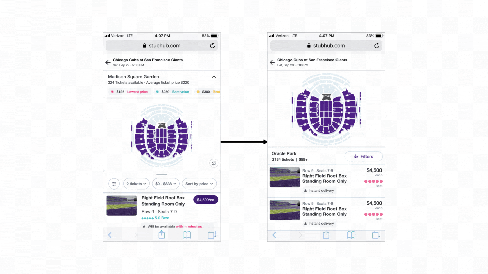
From Drawer to Split-Screen: Backed by Data, Not Opinion
Stakeholders initially pushed for a drawer-style layout, inspired by Yelp’s map and listing view. Through UX research and data, we showed that users needed both map and list visible at once to compare options effectively. The split-screen layout reduced toggling, improved context, and led to a smoother, more confident browsing experience.
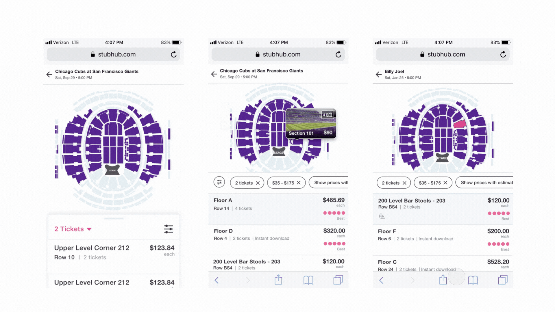
Helping Users Understand “Where” Instantly
To help users quickly understand where a ticket was located in relation to the stage, we introduced contextual highlighting on the map. This enhancement provided instant spatial clarity, reducing uncertainty and helping users make faster, more confident decisions.
It was a challenging feature to build due to the complexity of StubHub’s map data, but through close collaboration with engineering, we developed a technically feasible solution that maintained performance while improving usability. The feature was successfully rolled out and became a foundation for future seatmap interactions.
Impact on the business
5%
Increase in conversion
2.2%
Increase in GMS
80%
Completion rate on filters